How to Read a Renko Chart, Starting With the Box That Is Not Finished

Heads up: some links below are affiliate links. If you sign up through them we may earn a commission at no extra cost to you - it never changes what we recommend.
Read a Renko chart in passes: the run of boxes for direction, the wicks for real prices, and the chart timeframe for how finely those boxes were calculated. The box at the right edge is a projection bar rather than a finished one, so read it last and trust it least.
The LPFT Copilot runs a rules-based system on your own Tradovate account and reports what the broker actually filled. Start a 7-day free trial.
Start your 7-day free trialWhat one box is, in TradingView's own words
Learning how to read a Renko chart takes about ten seconds if you only want the surface. Boxes going up means price went up. Boxes going down means price went down. Every guide on the subject says that, and it is true.
It also leaves out the parts that decide whether what you just read was real. So start with the construction, because TradingView documents it precisely and the reading follows from it.
A box appears only when price moves. TradingView states that once the price moves more than the box size you defined, either above or below the most recent box, a new box is added to the chart. Two geometry rules follow: boxes always have their corners touching, and there can never be more than one box in any vertical column.
Touching corners and one box per column mean a Renko chart has nowhere to draw a gap and no way to show two things happening at the same level. The cleanliness you are enjoying is not the market being calm. It is the format declining to draw the mess. The full comparison against candles is in Renko versus candlestick charts.
Hold onto one more sentence of theirs before the first pass, because it governs everything below. Renko box prices, being inherently synthetic because of their nature, do not reflect market prices at any precise moment in time.
Pass one: read the run, not the individual box
The unit of meaning on this chart is the run, not the box. A single box tells you price moved by the amount you configured. That is all it tells you. Six boxes in a row tell you something about persistence.
So read it the way you would read a sentence rather than a letter. How long is the current run. Did the previous run end with a clean turn or with boxes alternating back and forth. Is the chart producing long one-directional stretches at this setting, or is it producing a staircase that changes direction every second box.
That last question is the useful one, and it is really a question about your own settings rather than about the market. A chart that keeps flipping direction is usually telling you the box size is too small for the instrument, not that the instrument is indecisive.
- A long run means price kept moving in one direction by multiples of your unit, with nothing big enough to turn it.
- Alternating boxes mean price is crossing your threshold in both directions, which is the chart telling you the unit is too fine.
- A turn means price moved against the run far enough to print on the other side. How far is set by your configuration, not by the chart.
You will see it claimed that a Renko reversal always takes exactly two boxes. TradingView's own Renko documentation does not say that anywhere we could read it, so it is not a rule we are going to state for you. Point and figure charts genuinely do have a documented reversal amount, which is a different chart and a different setting. Check what your own chart does at your own settings.
Pass two: the box at the right edge is not a box yet
This is the pass nobody teaches, and it is the one that changes how you read the chart.
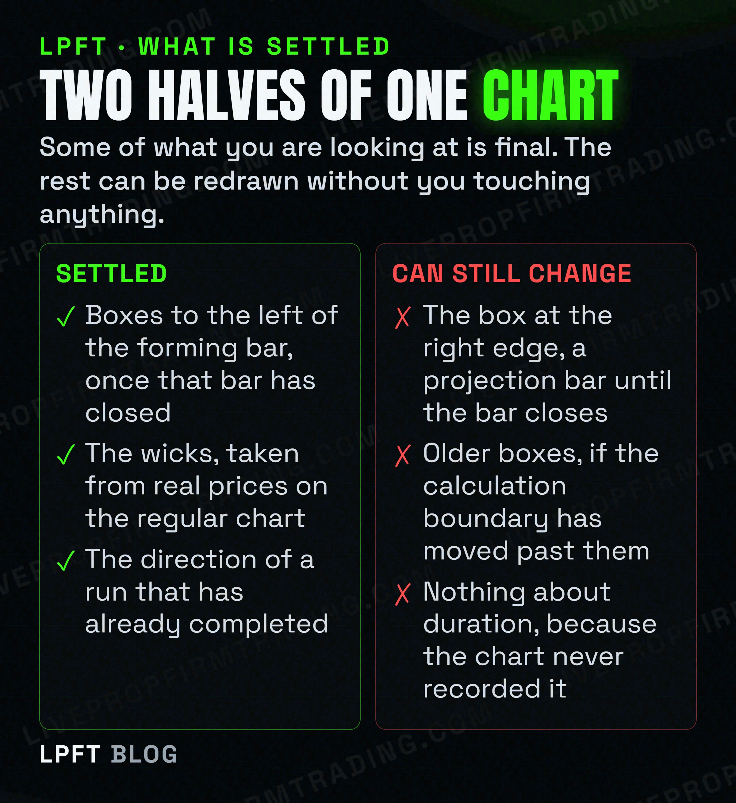
TradingView explains it on their page about Renko charts recalculating. Projection bars can only become real closed Renko boxes when the bar at the chart's timeframe closes. Therefore, they can recalculate until that happens.
Read that again with your chart open. The box at the right edge, the one you are watching form, the one that looks like it just confirmed your idea, is a projection. It is not a finished box and it can be redrawn before it becomes one. TradingView treats this as a real distinction rather than a footnote: the Renko style settings give projection up bars and projection down bars their own colour options, separate from the finished ones.
The same page states that the border between the higher and lower timeframes used in calculation is not static, and that it gets shifted into the future over time, which may lead to boxes being recalculated. A chart you screenshotted last month may not draw the same boxes today. Nothing broke. That is documented behaviour.
So the practical reading rule is boring and it works. Read the boxes that are behind the forming bar. Treat the one at the edge as a question rather than an answer. If a decision depends on that last box, you are making the decision on the least settled pixel on the screen.
Pass three: the wicks are the only real prices on the chart
Most people reading a Renko chart ignore the thin lines poking out of the boxes, because the boxes are the thing. That is backwards, and TradingView says so in one sentence.
Renko wicks are based on actual prices present on the regular, non-Renko chart, unlike Renko boxes open and close, which are synthetic. The neat stacked bodies everybody reads are values the chart generated. The thin lines everybody ignores are the market.
What they are for is equally specific. On a Renko chart, wicks show major price moves inside a Renko box, if they happened. High wicks appear only on boxes that move down and low wicks only on boxes that move up, which makes a wick the record of a move that came close to turning the chart around and did not. Wicks are enabled by default.
There is a detail worth knowing if you have changed your chart source. TradingView notes that the wicks follow it: with Close data the wicks represent the highest and lowest Close values, and with OHLC the highest and lowest wicks are based on the High and Low values respectively. Two charts of the same instrument can therefore show different wicks for an honest reason.
A long wick against the run is the chart admitting something happened that it chose not to draw as a box. It is the closest thing a Renko chart has to showing you a fight. Switching wicks off, which the chart settings let you do, removes the only honest prices on the screen.
Pass four: check which timeframe is calculating the boxes
A Renko chart still has a timeframe setting, and most people never look at it because the format is sold as the one that removed time. The setting is not decoration.
TradingView states that accurate Renko box calculation requires tick data, and that TradingView and data suppliers cannot make available the complete historical tick data required to calculate Renko boxes with maximal precision. In place of that, the chart's timeframe determines the finest level of detail used to calculate the boxes. A smaller timeframe is more accurate and carries less history.
Which gives you a genuine trade-off to make deliberately instead of by accident. A higher timeframe buys you more history and calculates each box more coarsely. A lower timeframe calculates more finely and shows you less of the past. Neither is the right answer, and whichever you pick is part of what your screenshot means.
| What you set | What it buys | What it costs |
|---|---|---|
| Box size method | Control over how much movement counts as one box. ATR moves with volatility, traditional stays fixed, percentage scales with price. | An ATR setting means two screenshots of the same instrument may not be comparable, because the unit itself moved. |
| Chart timeframe | A finer timeframe calculates every box from more detail. | Less history available, and the boundary where the calculation switches timeframes keeps moving forward. |
| Wicks on or off | Leaving them on keeps the only real prices visible on the chart. | Switching them off makes the chart tidier and strictly less honest. |
| Price source | Close or OHLC, which decides what the wicks are measuring. | Changing it changes the wicks, so a comparison across two charts needs both sources to match. |
The box size methods, the wick toggle, the price source and the chart timeframe are all TradingView chart settings, and the chart types available depend on your plan. If you are going to read from a non-standard chart, it is worth knowing exactly which settings produced the one in front of you.
Look at TradingView plans →The wider question of what a price-based chart gives up in exchange for ignoring the clock is covered in time-based versus price-based charts.
What this chart will never tell you, no matter how well you read it
Reading well includes knowing where reading stops. Three things are simply not on a Renko chart, and no amount of practice extracts them.
- How long anything took. Two adjacent boxes look equally significant. One may have taken four seconds and the other four hours. The clock was removed from the horizontal axis, so momentum is the one thing you cannot read here.
- A gap. The geometry forbids it. An overnight gap on a futures contract is real information and this chart has nowhere to put it.
- A price you could have traded at. The open and close of every box are synthetic. Only the wicks came from the real chart.
That third one is why a Renko chart is a reading tool and not a measuring one. TradingView is blunt about the consequence for anyone automating: Renko box levels, being disconnected from actual market prices at any given moment, will fill orders using their own prices and therefore will not produce reliable strategy results. Their repainting documentation files a strategy executing on a non-standard chart under unacceptable, and the tiers behind that word are in TradingView backtest repainting.
- Read the run, not the box. One box only tells you price moved by your unit.
- Treat the right edge as provisional. It is a projection bar until the timeframe bar closes, and it can recalculate until then.
- Leave the wicks on and actually look at them. They are the only real prices on the chart.
- Write down your settings. Box size method, value, timeframe and price source. Without all four, your own screenshot from last month is not comparable to today.
- Never read a fill off a box level. The level is synthetic and your broker fill will not be.
- Distrust any Renko screenshot used as proof, including a flattering one of your own, because none of the settings that produced it are visible in the image.
And keep the obvious in view. Trading futures involves substantial risk of loss. Learning to read a chart format more honestly changes what you can see, not what the market is going to do. If the next question is whether the chart can act on what it shows you, that has a precise answer in can TradingView place trades itself.
Frequently asked questions
Read it in four passes. First the run of boxes, because direction across several boxes is what the format is for and a single box only means price moved by the amount you configured. Second, skip the box at the right edge, which is a projection bar until the chart timeframe bar closes. Third, read the wicks, which are the only prices on the chart taken from the real market. Fourth, check which timeframe is calculating the boxes.
It means price moved more than the box size you defined, above or below the most recent box, so the chart added a new one. TradingView also states that boxes always have their corners touching and that there can never be more than one box in any vertical column, which is why the format cannot draw a gap.
Because that is documented behaviour, not a bug. TradingView states that projection bars can only become real closed Renko boxes when the bar at the chart timeframe closes, so they can recalculate until then. They also state that the border between the higher and lower timeframes used in calculation is not static and gets shifted into the future over time, which may lead to boxes being recalculated.
They are the most important prices on it. TradingView states that Renko wicks are based on actual prices present on the regular, non-Renko chart, unlike Renko boxes open and close, which are synthetic. Wicks show major price moves inside a box if they happened, high wicks only on down boxes and low wicks only on up boxes, and they are enabled by default.
We are not going to tell you it does. TradingView's own Renko pages document box creation, touching corners and one box per column, and say nothing we could read about a two-box reversal rule. Point and figure charts do have a documented reversal amount that specifies how many boxes price must move for a new column to be created, but that is a different chart type. Check the behaviour at your own settings.
No, and that is the format's main blind spot. Time was removed from the horizontal axis, so two adjacent boxes look equally significant whether one took seconds and the other took hours. Anyone judging momentum from a Renko chart is reading a picture with the clock taken out.
Eli Y.
Eli builds and runs rules-based automated futures systems on TradingView and Tradovate, and helps traders take emotion out of the screen. He writes about futures automation, prop-firm evaluations, and the tools that connect them - plainly, and without hype.
Risk disclosure: Trading futures involves substantial risk of loss and is not suitable for everyone. This article is educational content only and is not financial advice or a recommendation to trade. Past performance is not indicative of future results. Some links are affiliate links.